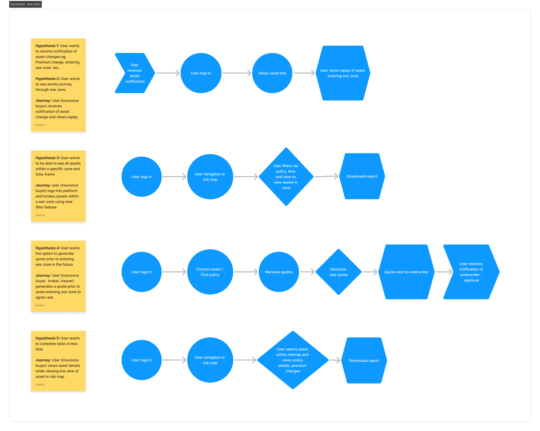
- User wants to receive notification of asset entering war zone
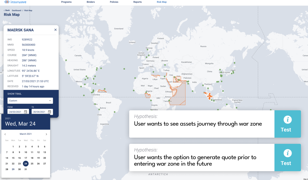
- User wants to see assets journey through war zone
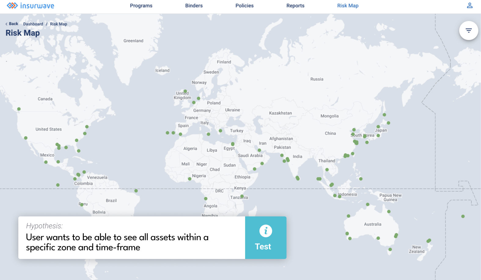
- User wants to be able to see all assets within a specific zone and time-frame
- User wants the option to generate quotes prior to entering war zone in the future
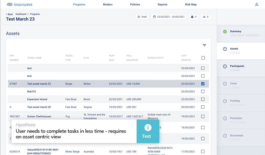
- User needs to complete multiple tasks in less time - requires an asset centric view
Insurwave
UI/UX design | Case study
Keywords:
UI UX design, UX research, Case study, Agile team, Start-up, B2B, Saas product, Insurtech (insurance technology).
Reading time:
5 minutes
Status:
Complete
Tools:
- Pen & paper
- Figma
- Adobe
- Hotjar
- Google analytics
- Jira
Team:
- UI UX Designer (Me)
- Business analysts
- Product owner/s
- Front-end engineers
- Client success
Tasks:
- Business research
- User research
- UX discovery and ideation
- User interface design
- User testing
- Technical support
Introduction
Scene setting:
Insurwave is a young speciality insurance technology (Insurtech) start-up. Their primary aim is to transform the way specialty insurance and reinsurance are transacted. The Insurwave product is a SaaS platform that connects insurance buyers, brokers, and sellers and offers them a way to consolidate and visualise their data and to understand their risk and make more informed transfer decisions.
Team structure
I was a key member of the product team, consisting of product owners and business analysts, and development teams consisting of front-end and full-stack engineers.
My responsibilities:
As the founding UI UX designer, I oversaw all areas of research, design and front-end development. I worked autonomously and in collaboration with product and client success teams to conduct market and user research and to define design solutions. I worked closely with development teams to ensure smooth hand-over and delivery.
Business research
Define the problem:
Kick-off workshop: I met with senior stakeholders, marketing, business analysts, product owners, engineers to understand the what they knew about the problem and what measures had been explored already to resolve the problem. These initial meetings provided valuable insight into what was known in terms of the products strengths and weaknesses; what was known in terms of threats in relation to the wider market and what threats could be impacting the UX; what opportunities were available for the product what the team had envisioned in terms of successes for the platform; and what steps had already been put in place to achieve this.
Takeaways: In summary, as the platform was in early its early stages of its life there was much to be done in terms of mapping user journeys and many tasks still required input from the backend. One goal was to automate many of these processes and to create journeys that would provide the users with a means of carrying out such tasks themselves. These for example include: asset creation, policy creation and renewal, adding a cover to a policy etc. The overarching goal expressed by stakeholders was to (1) improve on the existing user journeys and (2) enable new features, such as the ability to track assets and be notified of any changes (e.g. premium change, war zone journeys). The company had an understanding of who their audience was and had developed three main persona types: the broker, the insurer and the insurance buyer. More research was needed however, to understand more about each of these user types to develop a deeper understanding of their roles, their day-to-day tasks, pains and goals in order to develop empathy and meet their needs.
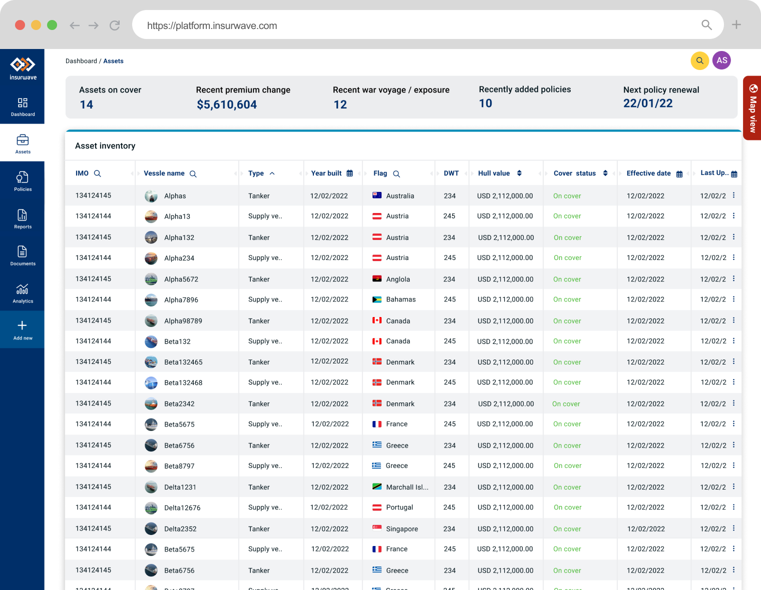
Design review
This research looked at what has been achieved in terms of design and what needs to be improved so that all future research and design solutions align with the goals of the organisation.
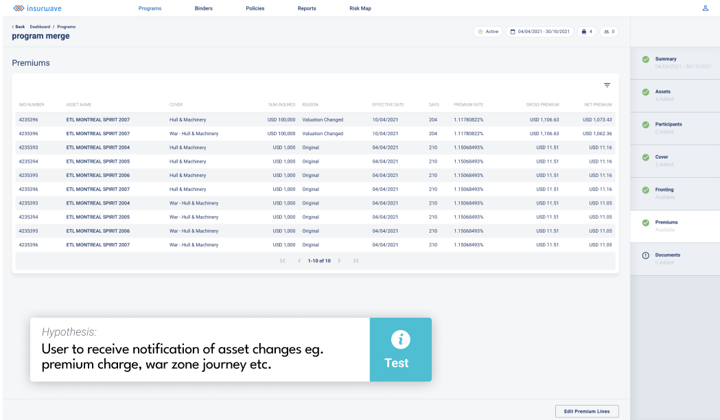
Current process to view asset details:
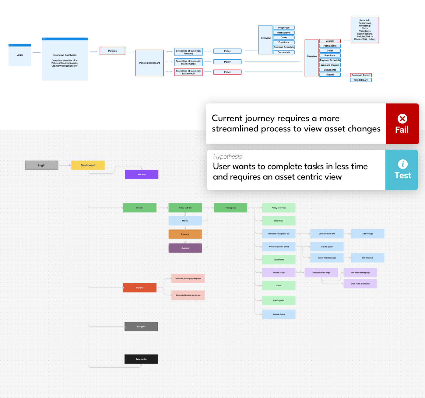
Business goals:
Concluding the business research phase, I established what the overarching goals of the company were that would need to be uncovered during the user research phase. With these goals in clear view, I was able to determine which users would need to be involved in the user research phase and what questions would need to be answered.
User research insights
Define the user:
Using the information gathered from stakeholders and team members, key user groups were defined and these groups were invited for a series of interviews.
User research (field and desk research):
To gain a more comprehensive understanding of each user group's ethnography, both desk and field research was conducted to understand the insurance field and the insurance nomenclature used, the tasks involved in the day-to-day role of insurance buyers, brokers and insurance companies. Interviewing these user groups in their own environment provided insight into their individual goals, desires, and day-to-day pains.
Discussion: The information collected from the user research was then collated and reevaluated against previous understandings of the user's personas. This involved a series of discovery sessions in what we termed 'blank canvasing'. In these sessions, information was presented against each user interviewed highlighting:
- User's day-to-day tasks
- User's goals
- User behaviours
- User's software
- Other parties involved in user's tasks
- User's pain-points
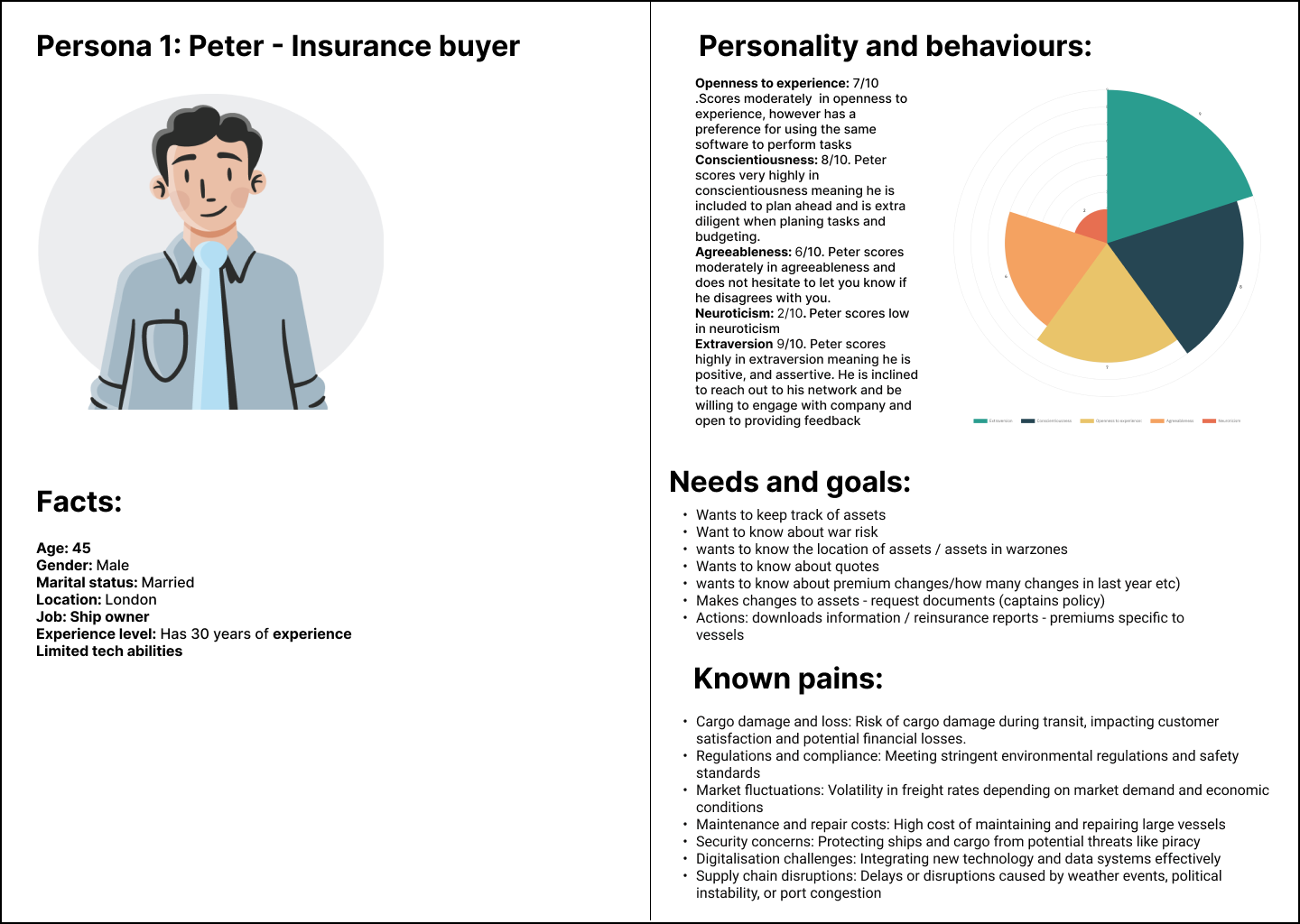
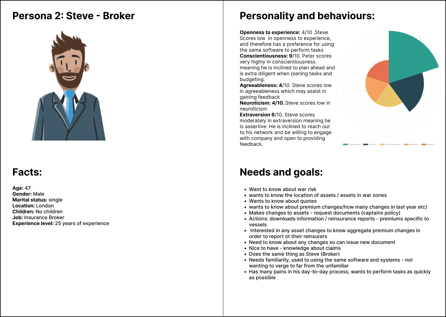
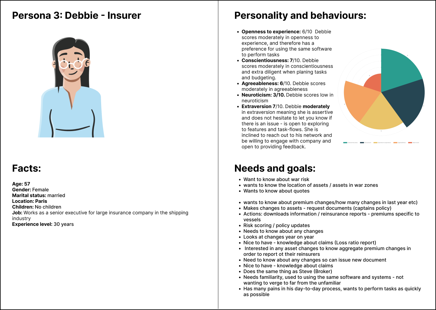
Hypotheses:
Based on the business and user research conducted, the following hypotheses were developed:
Design discovery
User journey map:
The hypotheses that were gathered from research provided a foundation to begin the initial user journey maps. These journeys were first presented in series of process flow charts which help to illustrate the user’s end to end process in: (1) tracking vessels (2) filtering content within risk map; (3) creating a quote on ‘agreed rates’; (4) receiving notifications of and viewing asset changes:
Lo fidelity prototypes:
A series of user journeys were created and prepared for prototype user testing.
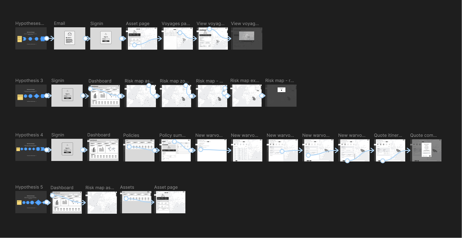
Test hypothesis (pre-design test):
Initial concepts were presented to senior stakeholders and small iterations were carried out before presenting prototypes to key user groups. In these sessions valuable feedback was gathered and further iterations were made before a follow-up session was conducted.
Refine journey:
I reflected on what was learned from the research and information gathered and adjusted the initial concepts until all parties were happy to proceed to the next steps.
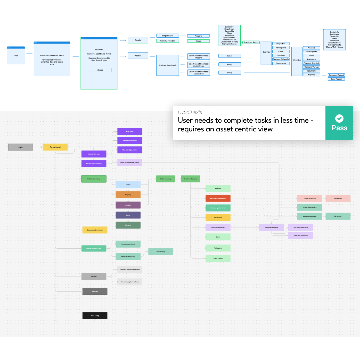
Information architecture:
Research insights helped to reassess the IA and how potential changes could positively impact the users journey to complete tasks. For example, by creating an asset-centric view users were able to perform a journey in less time. Creating a secondary level of navigation and filtering also allowed users to perform tasks that were previously not available.
Updated information architecture:
Accessibility:
The following areas were assessed to ensure the design was accessible complied with WCAG 2.2 standards:
- Text size: large enough to be legible
- Content: images and text are not cropped or outside the user’s viewport
- Contrast: ensure there is enough contrast ratio between the foreground and background of text complying with Web Content Accessibility Guidelines (WCAG) (minimum contrast ratio of 4.5:1 for normal text and 3:1 for large text).
- Responsive: the product is accessible on different screen sizes
- Hierarchy: ensure that the interface can be navigated using the keyboard
User testing
Post-design test:
Incorporating information gathered from research, generate a range of design concepts, presenting to senior stakeholders, and key users, testing and generating feedback throughout the iterative process.
Debrief:
Before design completion and hand-off, I worked closely with project manager, product and engineering teams to estimate time and prioritise tasks. These tasks were then presented to the wider team at realise-train planning sessions and prioritised for development.
Design Hand-off
Development:
Prior to the beginning of development, I provided all necessary items such as user journeys, sitemap, content (image files etc.), font files, icon files, wireframes and style guides. I ensured developers had access to all necessary tools and software knowledge (e.g. guide them how to use Figma dev environment) and took necessary steps to ensure nothing was missed and that pixel perfect quality was translated into the coded version.
Throughout the development stages, I worked closely with my team of engineers to implement designs or changes to code. This involved daily stand-ups were myself and front-end development teams would update on tasks and provide answers to any questions.
Analytics (post-launch):
After launching and implementing changes across the platform, performance goals were set in order to assist in the analysis of metrics data collected. Goals for example focused on session and task length, errors and page performance. Performance metrics allowed us to track such behaviour by carefully analysing user sessions using Hotjar and assessing overall performance using a number of metrics tools such as google analytics.
Want more information? Get in touch.