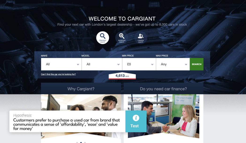
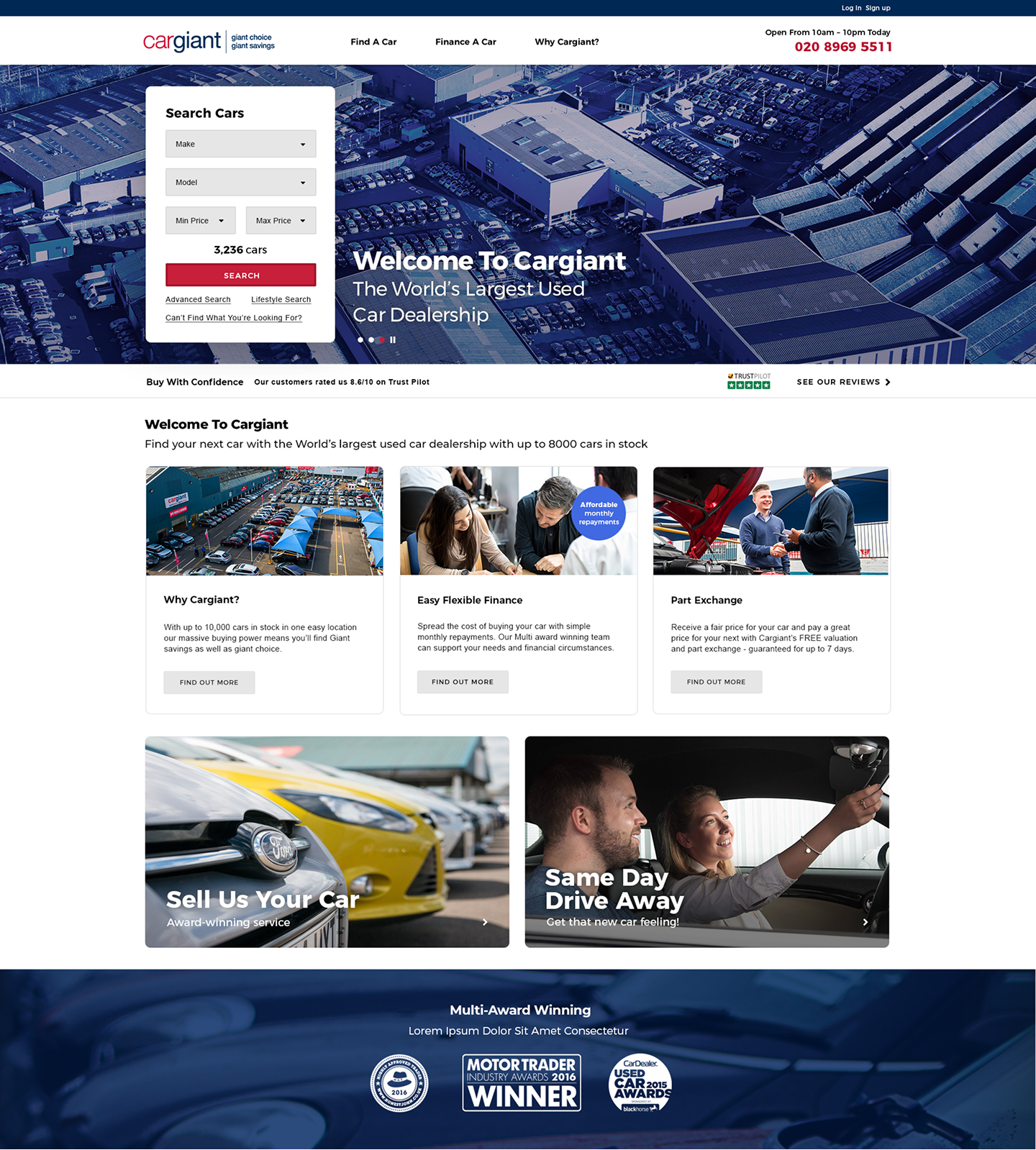
- Customer prefers to purchase a used car from brand that communicates a sense of 'affordability', 'ease' and 'value for money'
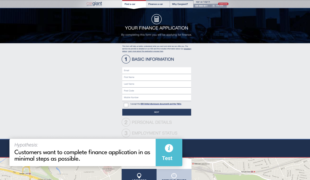
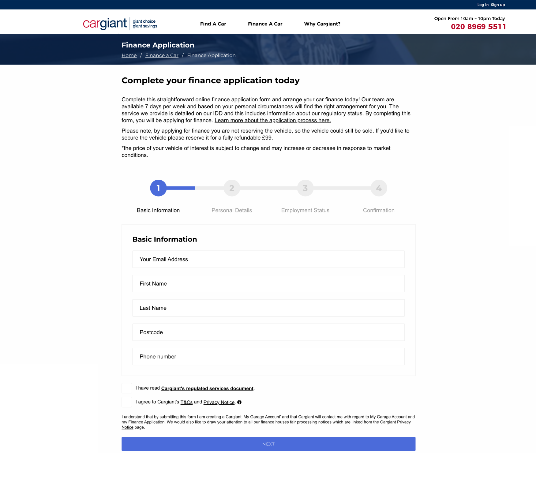
- Customer wants to complete finance application in as minimal steps as possible
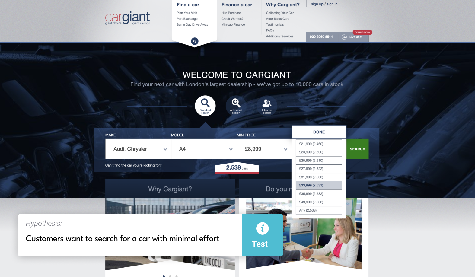
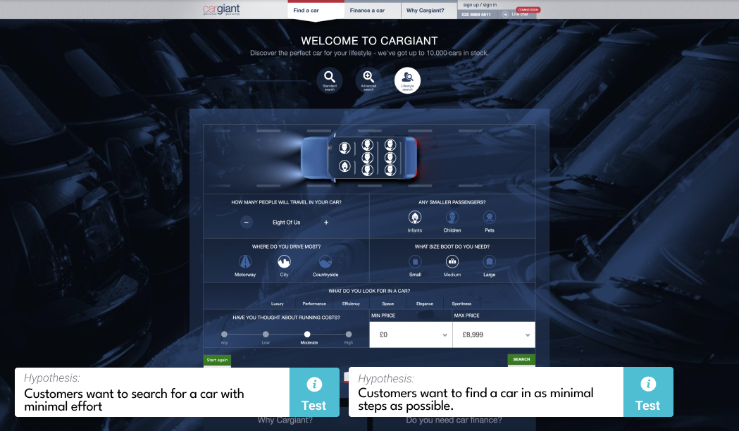
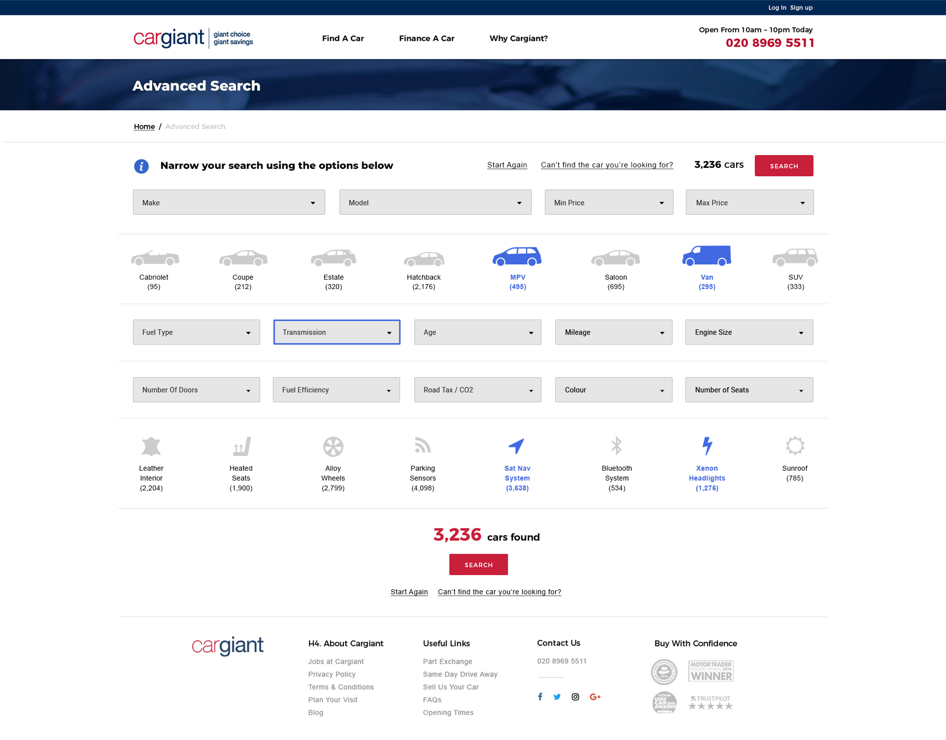
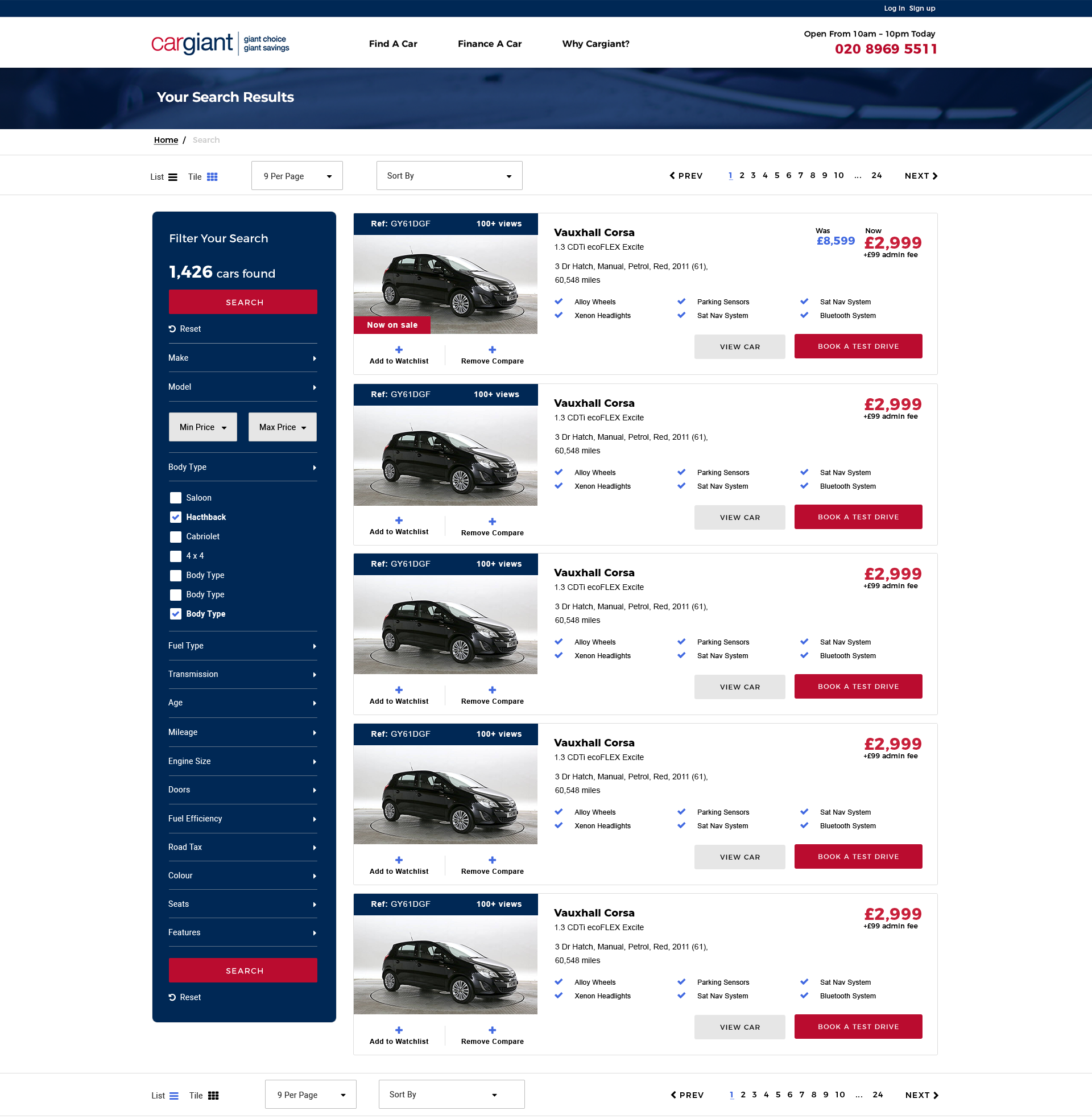
- Customer wants to search for a car with minimal effort
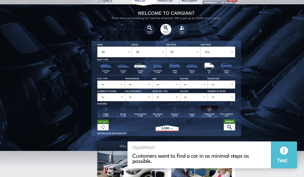
- Customer wants to find a car in as minimal steps as possible
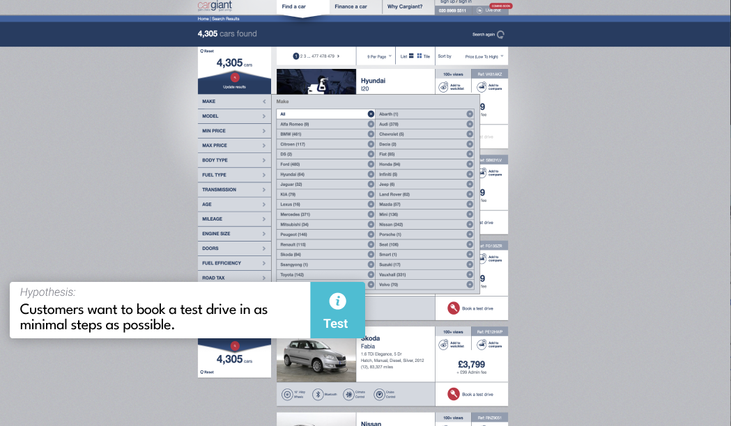
- Customer wants to book a test drive with minimal effort
Cargiant
Visual Design | UI design | Case study
Keywords:
Visual Design, Print design, UI UX design, B2C, Case study.
Reading time:
1 minute
Status:
Complete
Tools:
- Pen & paper
- Adobe XD, Illustrator, Photoshop
- Google analytics
Team:
- Senior Graphic/Digital Designer (Me)
- Marketing Director
- Front-end Engineer
- Back-end Engineers
Tasks:
- Business research
- User research
- User interface design
- Technical support
- Visual Design
- Print Design
- Email Design
Introduction
Scene setting:
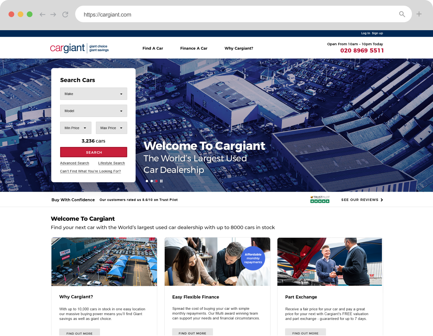
As Senior Graphic Designer my tasks included: redefining brand aesthetics whilst maintaining recognisable characteristics; redesigning website and working closely with marketing director to redefine user-journeys using information collected through user research and testing.
Business research
Define the problem:
Kick-off workshop: I met with stakeholders to understand what they knew about the problem and what had been explored already to address the problem. These meetings provided insight into what was known in terms of threats in relation to the wider market and what threats could be impacting the UX.
Design review
I gained insight into the potential opportunities that were available for the design; what the team had envisioned in terms of successes; and what steps had already been put in place to achieve this.
Takeaways:
After having launched the new company website in 2017, there was a noticeable decrease on RIO. Many factors contributed to this change, however, there was growing concern that the website was not performing as well as expected. The primary concerns highlighted were:
- Updated design did not accurately reflect brand's message
- Finance application journey was not user-friendly
- Search journey was not user-friendly
User research insights
Define users:
Using the information gathered from stakeholders and team members, key user groups were defined and these groups were invited for a series of interviews.
User research (field and desk research):
Qualitative and quantitative research had been undertaken to understand key target group behaviours. The following tools were employed to investigate the problems in the current journey:
- Interviews: interviews provided insight into user goals, behaviours and attitudes.
- Ethnography: field research (observing customers in their environment) was undertaken to understand key user groups, their buying behaviours, and attitudes towards the brand.
This information helped form the bases for the user personas.
Define behaviours:
Working closely with stakeholders, research was undertaken to understand key target group behaviours. The following tools were employed to investigate the problems in the current journey:
- Usability tests: observational test to understand user pain points.
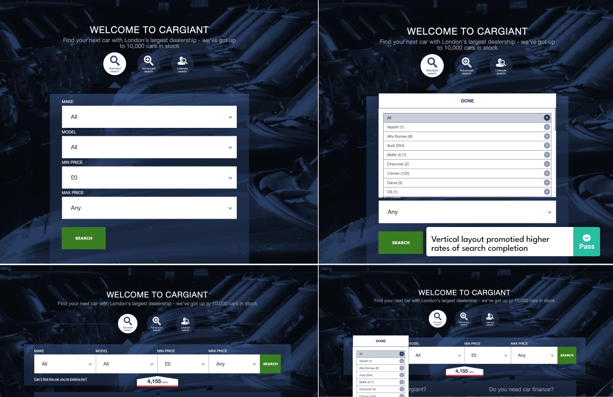
- A/B testing: tested various features i.e. search forms to understand whether layout, hierarchy, position, content affected the user journey.
A/B Tests insight:
A/B testing found that users preferred the vertical form layout:
Discussion:
The research collected from the user testing sessions presented valuable insights into user pain-points and provided guidance into the various steps required to enhance the user experience. This information also formed the bases for the following hypotheses.
Hypotheses:
Design delivery
Design phase:
Initial concepts were presented to stakeholders after which small iterations were carried out. Prototypes were later presented to key user groups where valuable feedback was gathered and further iterations were made before design handover.



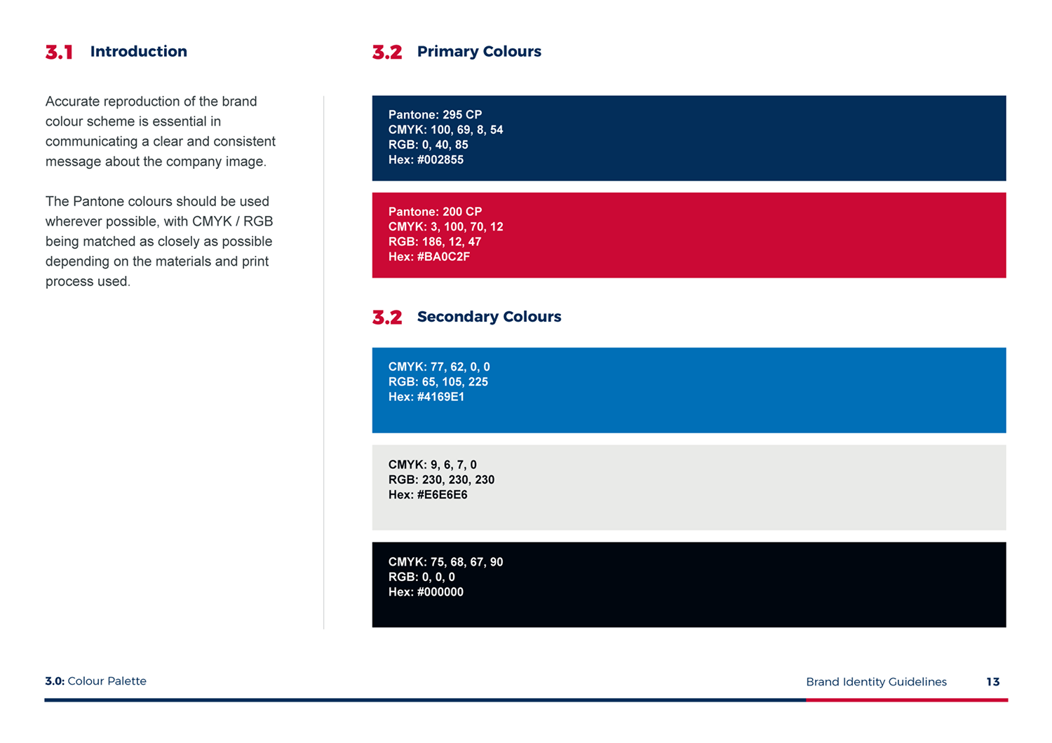
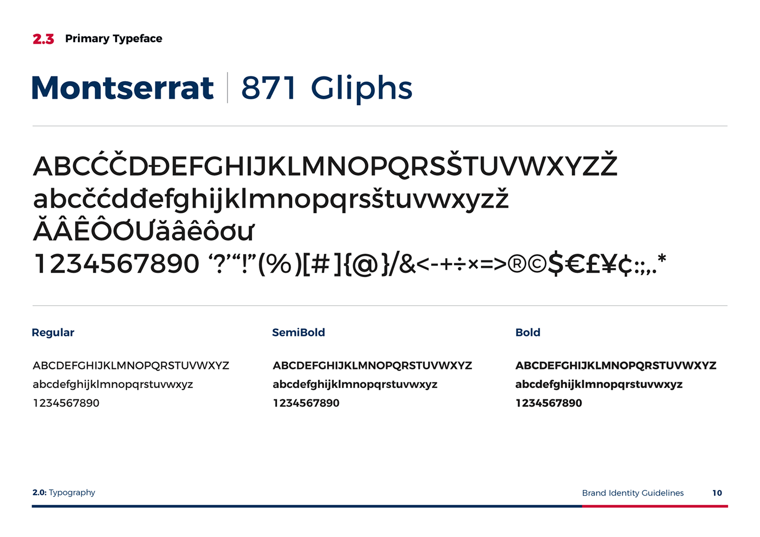
Accessibility:
The following areas were assessed to ensure the design was accessible and that it complied with WCAG 2.2 standards:
- Text size: ensure text is large enough to be legible
- Content: ensure images and text are not cropped or outside the user’s viewport
- Contrast: ensure there is enough contrast ratio between the foreground and background of text complying with Web Content Accessibility Guidelines (WCAG) (minimum contrast ratio of 4.5:1 for normal text and 3:1 for large text).
- Responsive: ensure that the website is accessible on different screen sizes
- Hierarchy: ensure that all webpages can be navigated using the keyboard
Design hand-off
Debrief:
Prior to design hand-off, I provided the engineering team with all necessary files and documentation. I ensured that the engineer team had access to all necessary tools and software knowledge, and I provided front-end development support to a team of backend developers when they required assistance. Throughout the development stage, I worked closely with development teams to ensure smooth delivery and I filled the communication gap between technical and non-technical teams, ensuring all teams were informed and updated throughout the process.
Want more information? Get in touch.